Concept
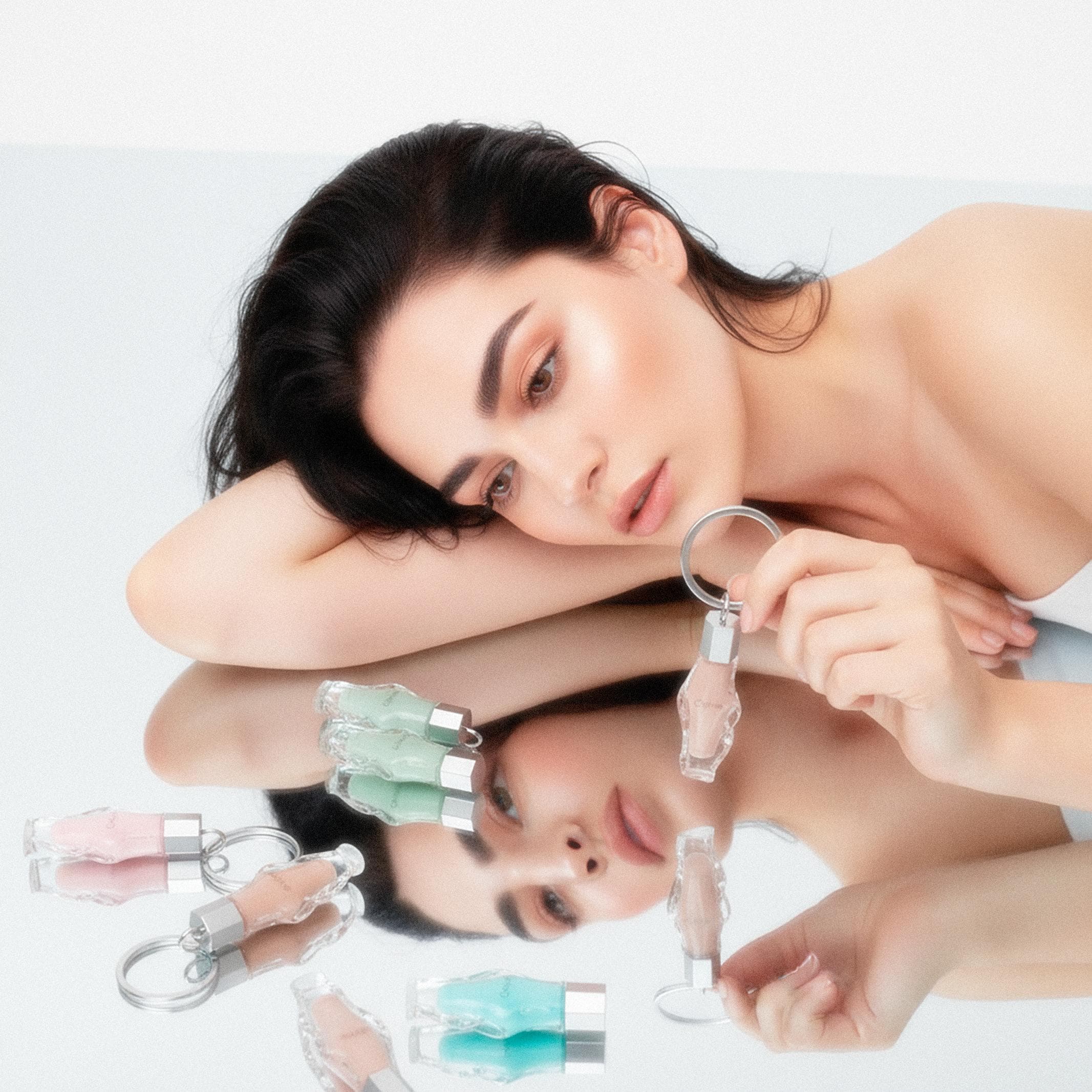
Ophie is a lip oil brand created for your everyday beauty routine. Designed for the clean girl who wants to glow effortlessly, Ophie combines hydrating ingredients that nourish and comfort your lips with a formula that looks as good as it feels. Through sleek packaging and refined branding, Ophie embodies a modern, feminine aesthetic — simple, dewy, and undeniably fresh.
This was my first project where I experimented with AI tool, in this case Adobe Firefly as I had a very specific art direction that i wanted to follow, and there were no actual mockups that I could use to achieve it.
Research
Development
—
Process
The Bottle Design and Formulas
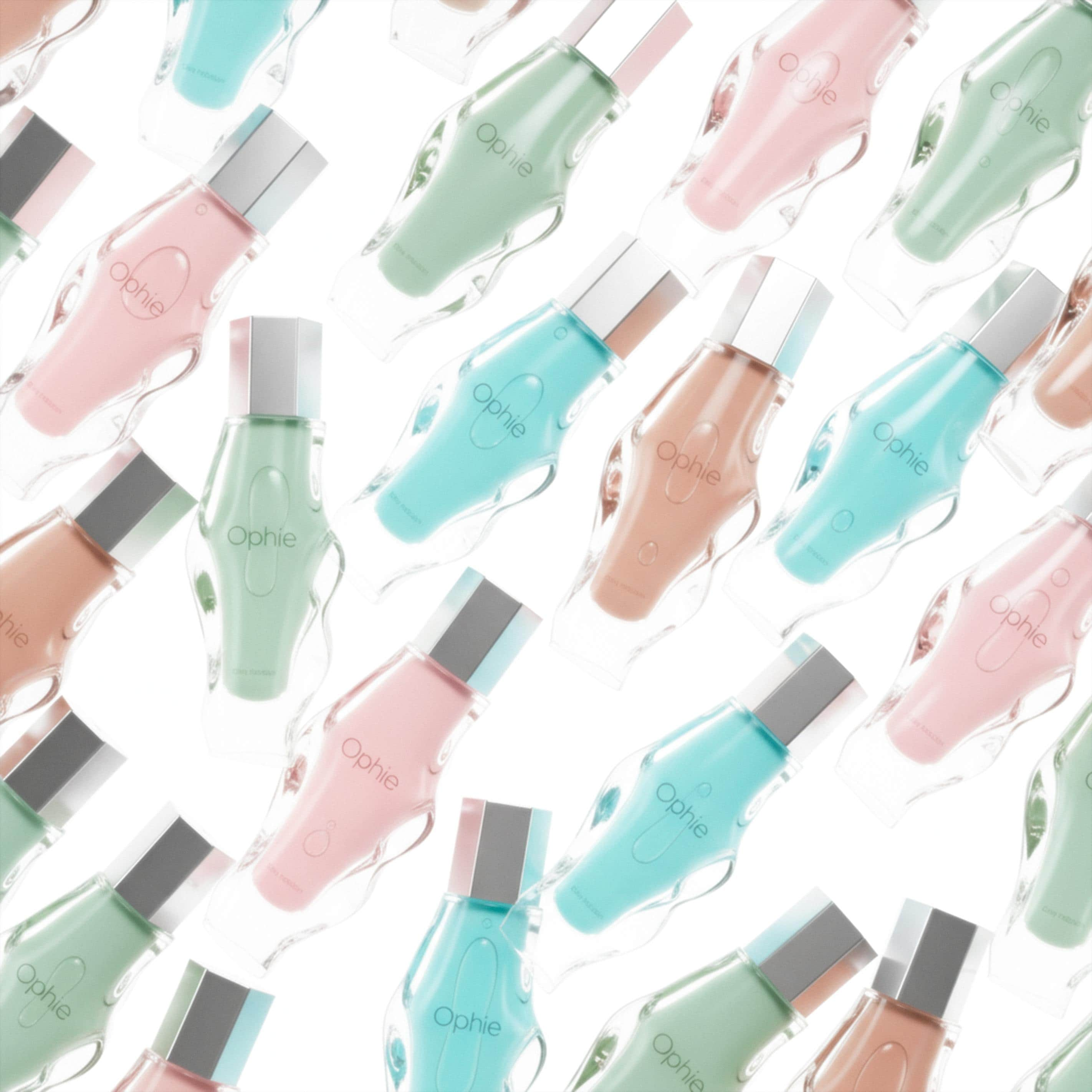
The bottle design was inspired by an existing serum bottle that the brand had used to represent the fluidity of their product, a concept that perfectly aligned with my own vision for Ophie. My goal was the same: to capture a sense of movement and softness that reflects the texture and essence of the lip oil itself. Beyond the product design, I also developed the formulas. As a fan of lip oils and hydrating textures, I truly enjoyed the research process. I concluded that the best combination is always sweet and glossy. With that in mind, I began moodboarding and eventually defined four main flavors and colors: Strawberry Chocolate, Lime Pie, Blueberry Extract, and Tiramisu Dessert.
Furthermore, when I realized that the individual packaging design would be complex and irregular, I decided to follow the path of less is more for the logo and text. I used the font Hurme Geometric Sans, which was also applied to the secondary text. This typeface is extremely clean, readable, and subtly feminine — making it the perfect match for Ophie's modern and refined identity.


The creative process
I created two main packaging types: the Individual and the Pack. Both share one main motif which is the bottle silhouette that represents the most recognizable element of the brand. The second key aspect is color. For the individual package I followed a clean minimalist approach with the lip oil shade embossed silhouette logo product description and flavor name. On the side I added an image of the flavor ingredient so buyers can visually connect with their choice along with a short phrase about the natural and organic origin of the formula.
For the Pack box I kept the same concept but without color since it contains multiple flavors. The white embossed silhouette on the lid adds a subtle element of surprise while the textured interior enhances the experience with a natural and organic feel. The bottles are placed in cutout silhouettes side by side for a balanced and luxurious presentation.


