Exploring Concepts
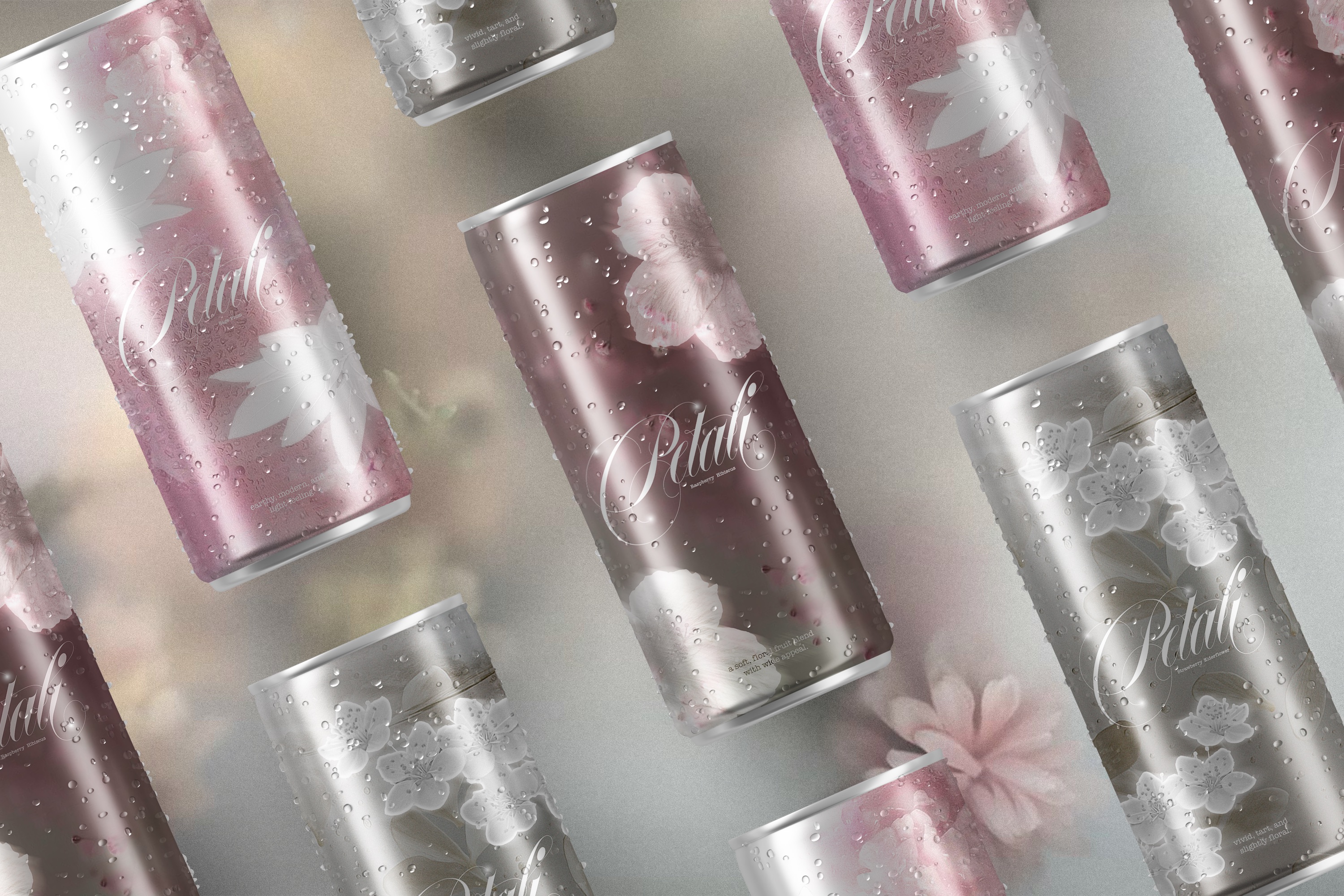
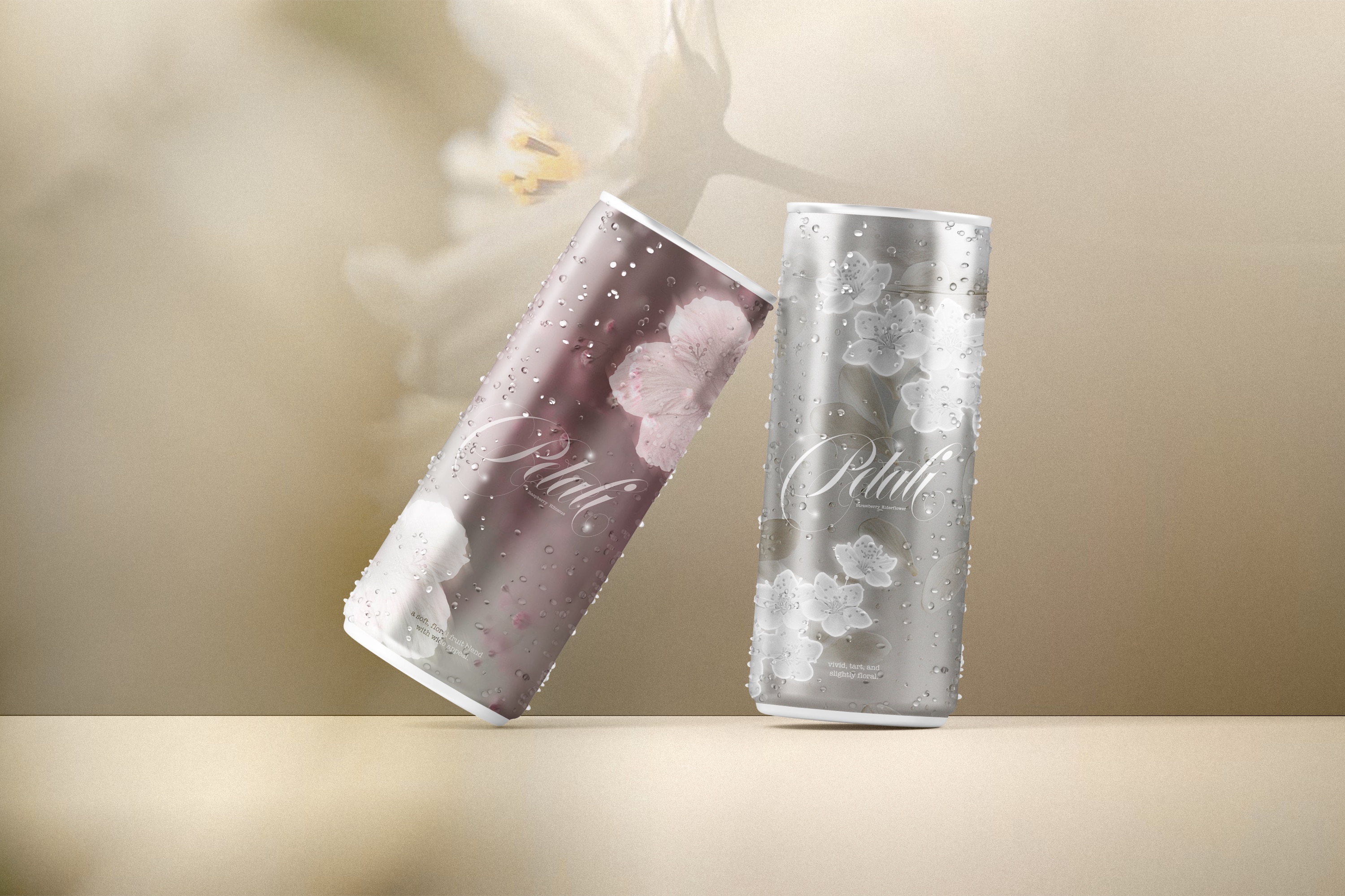
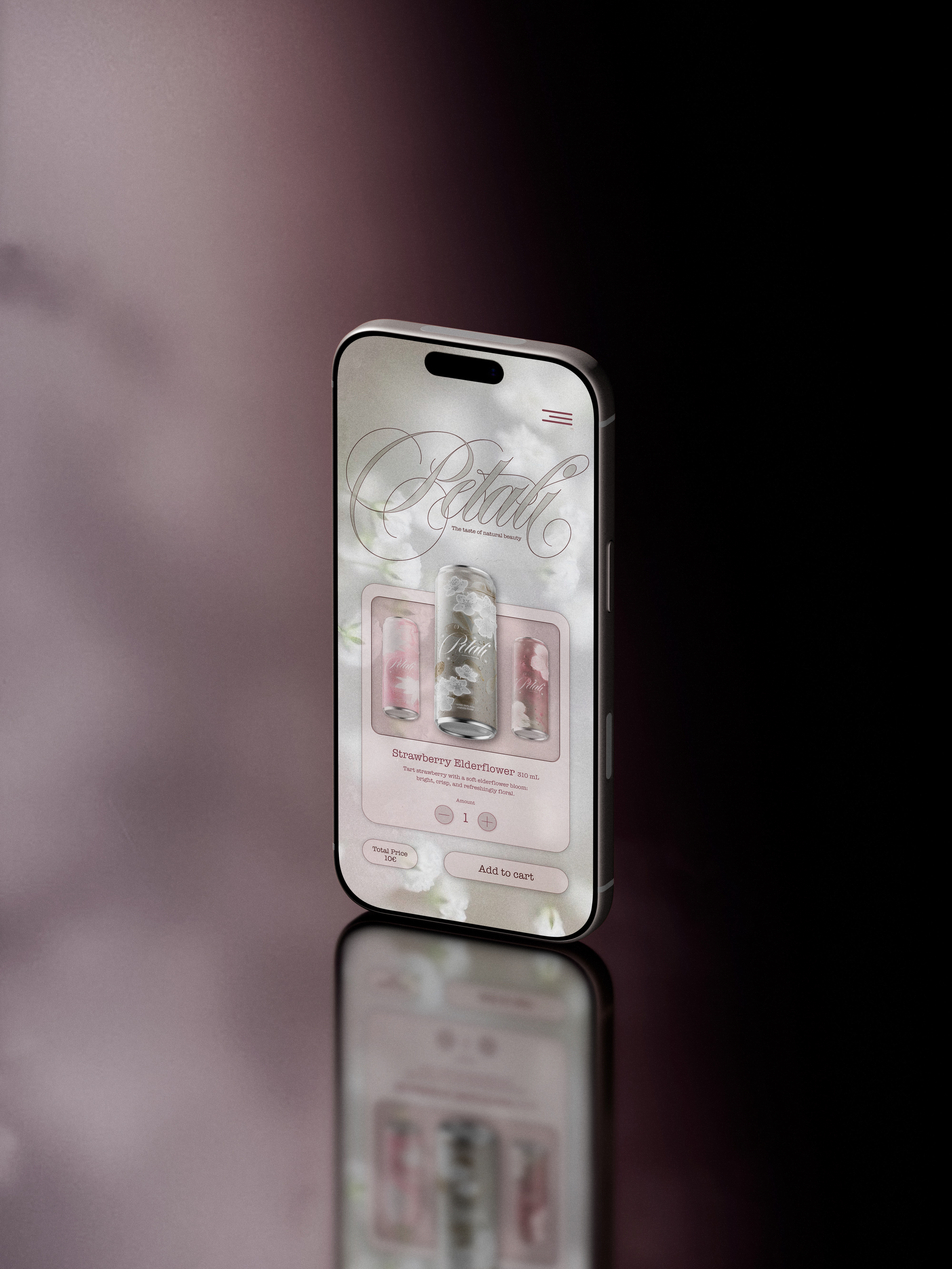
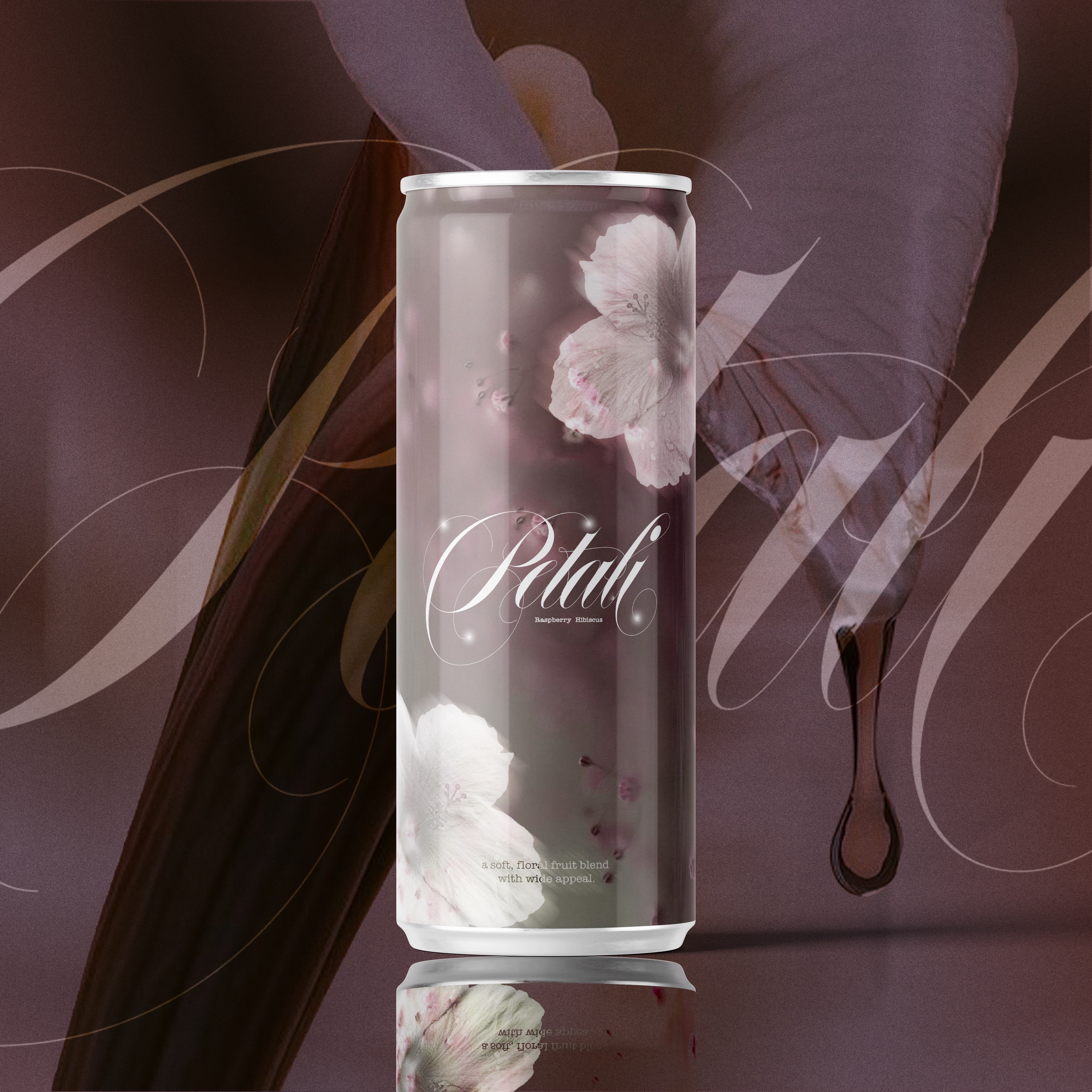
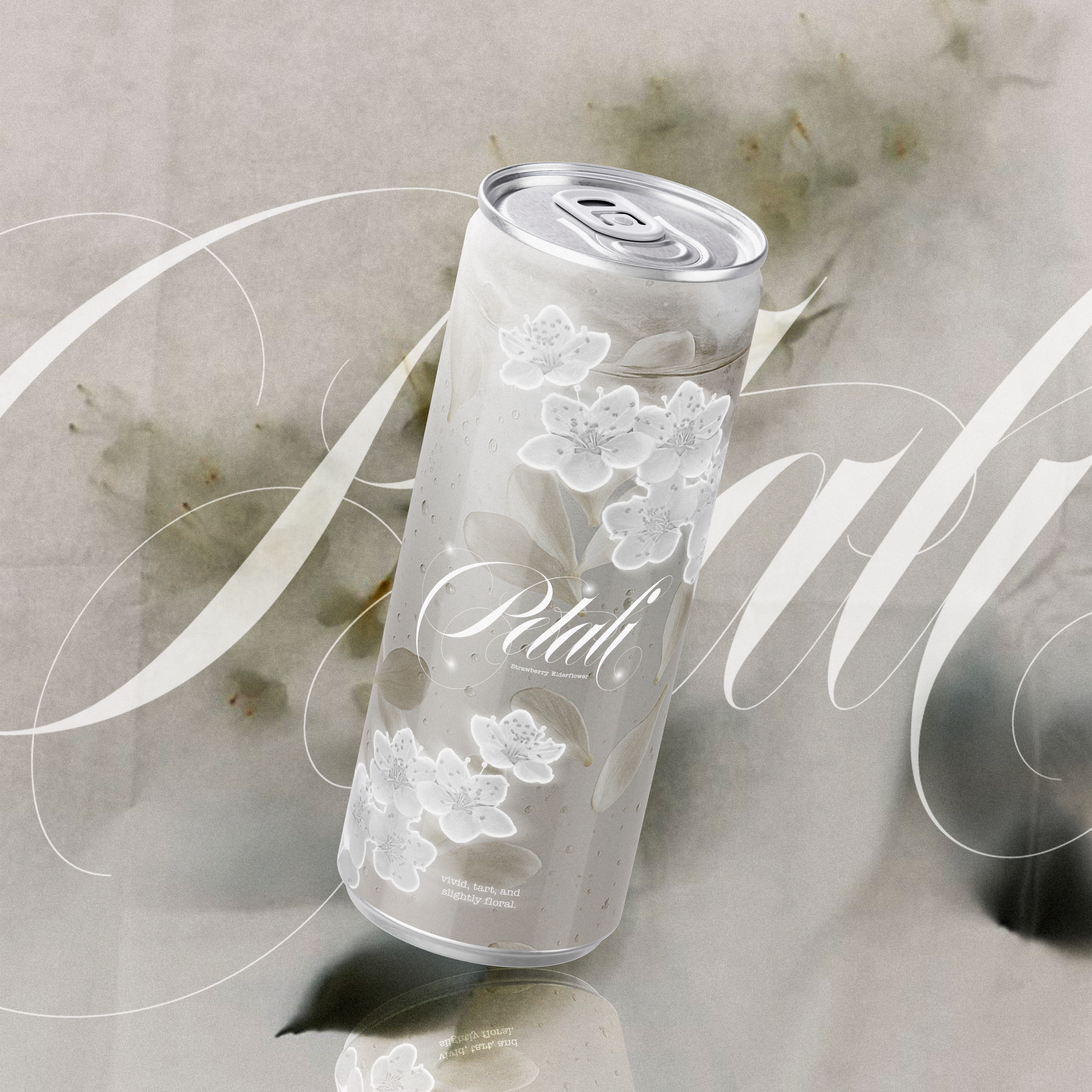
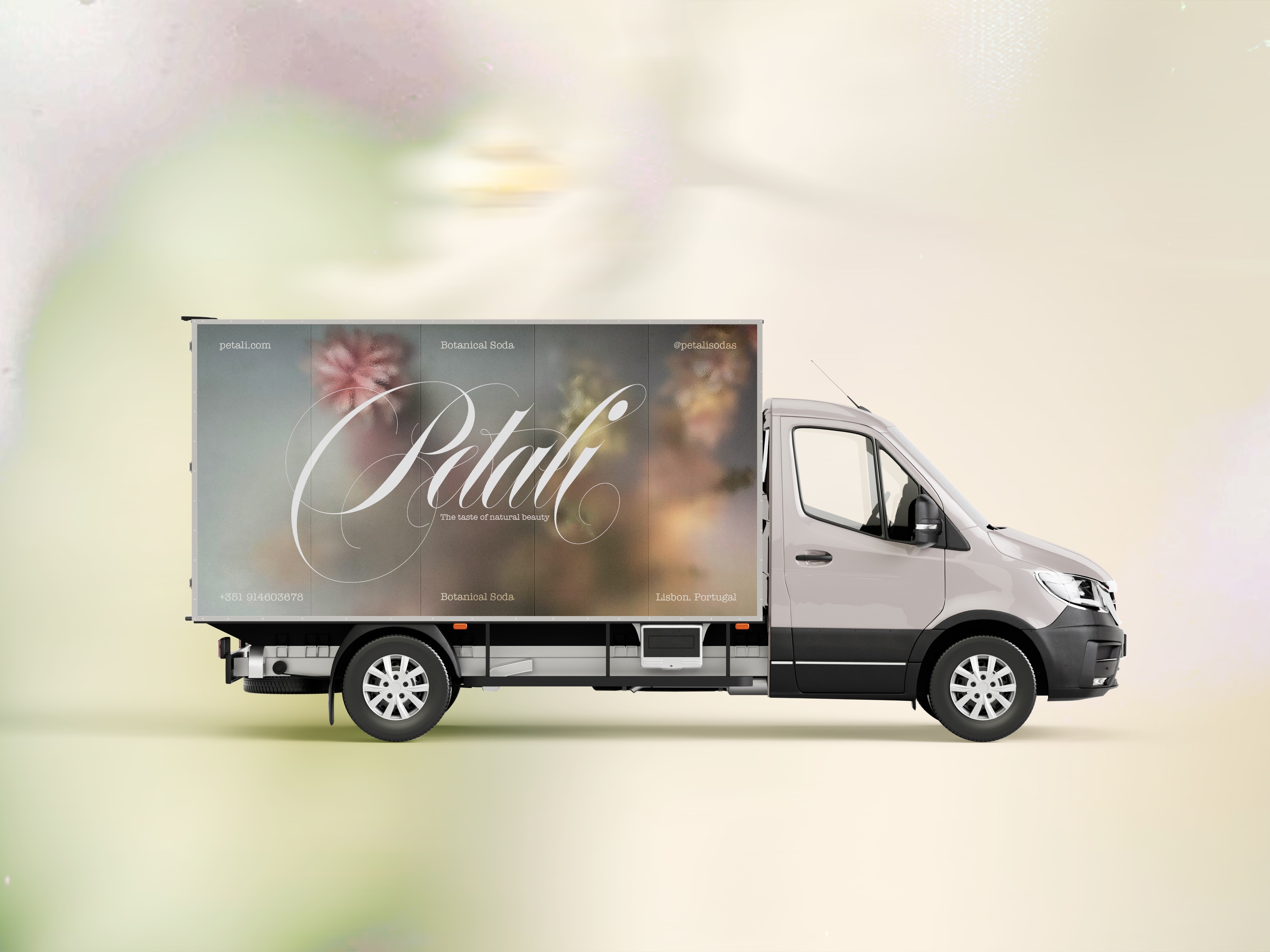
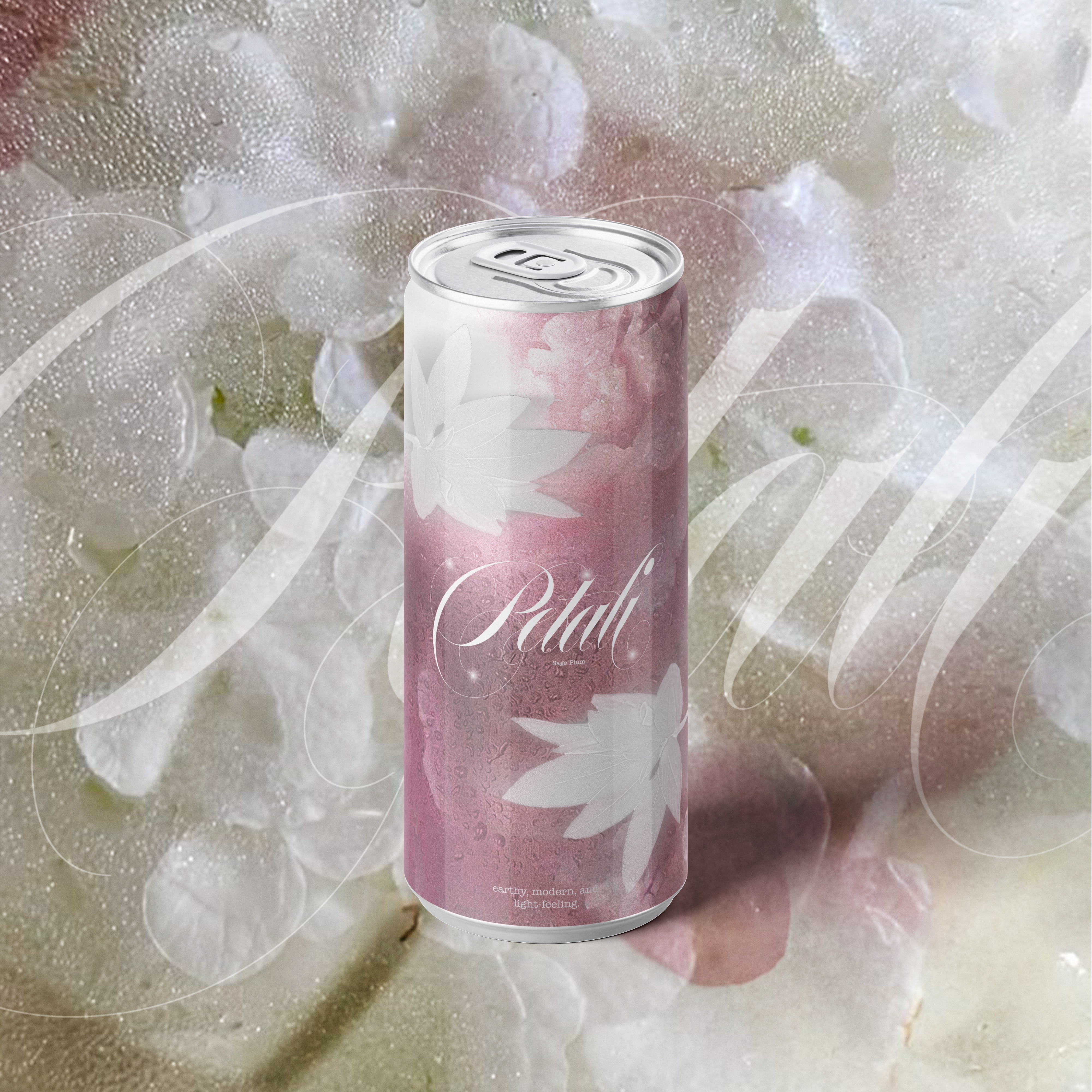
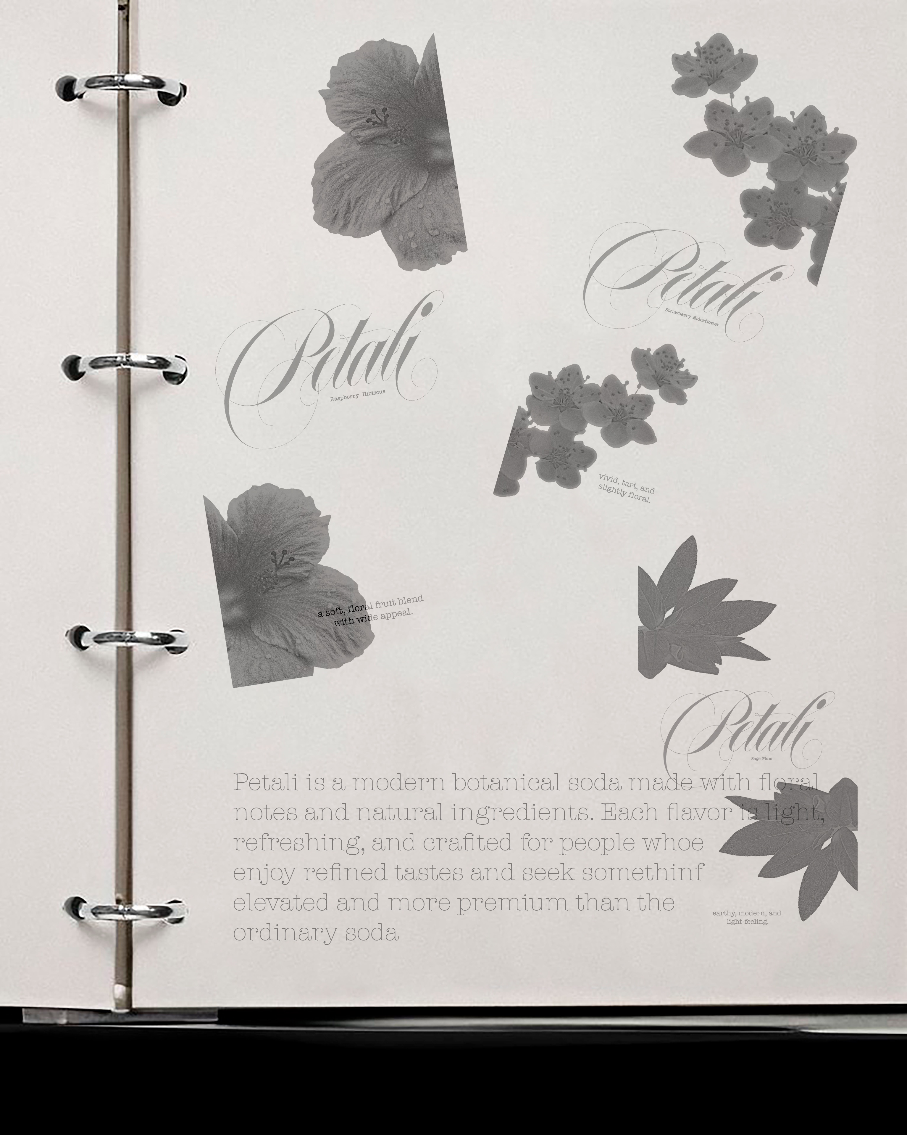
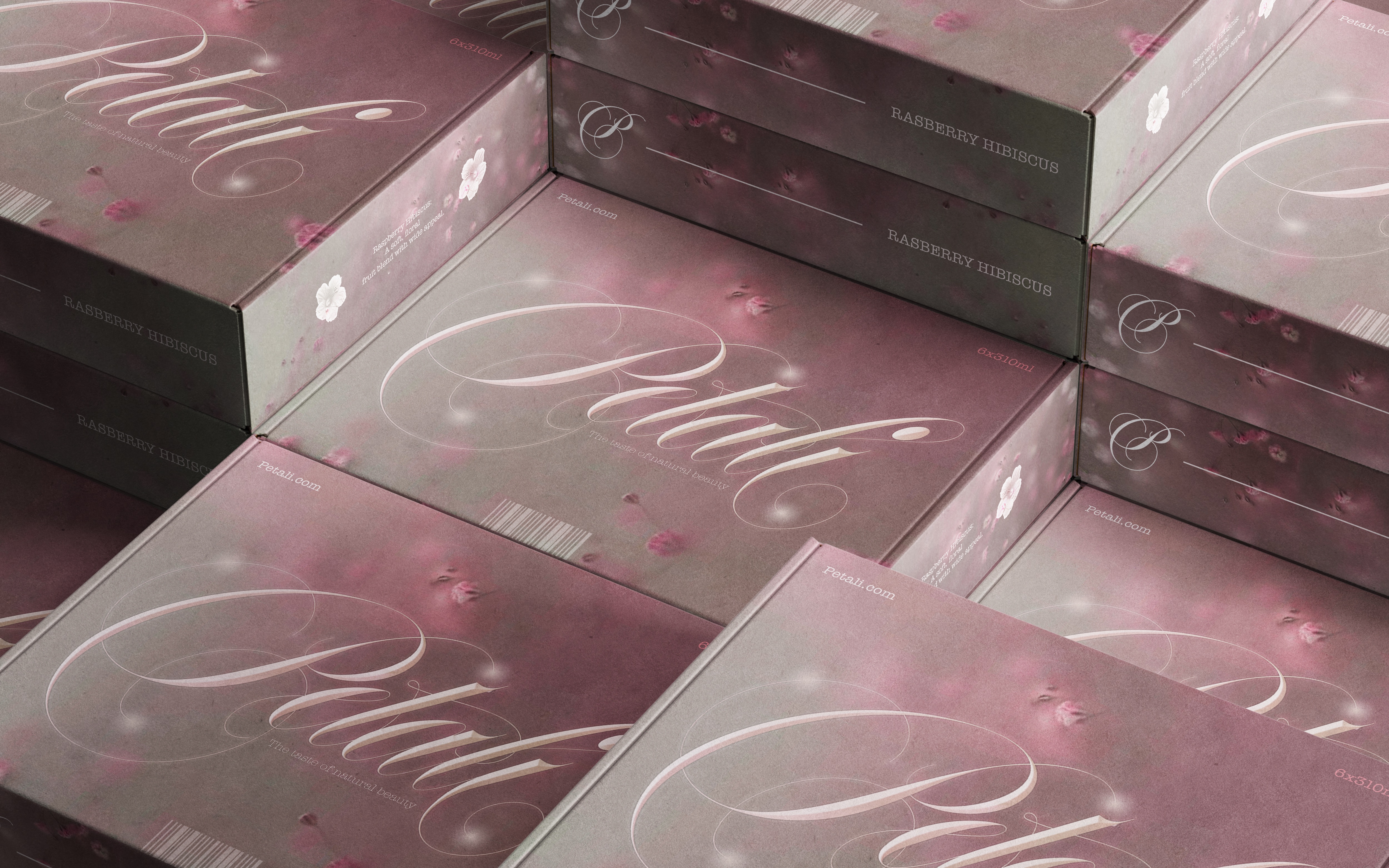
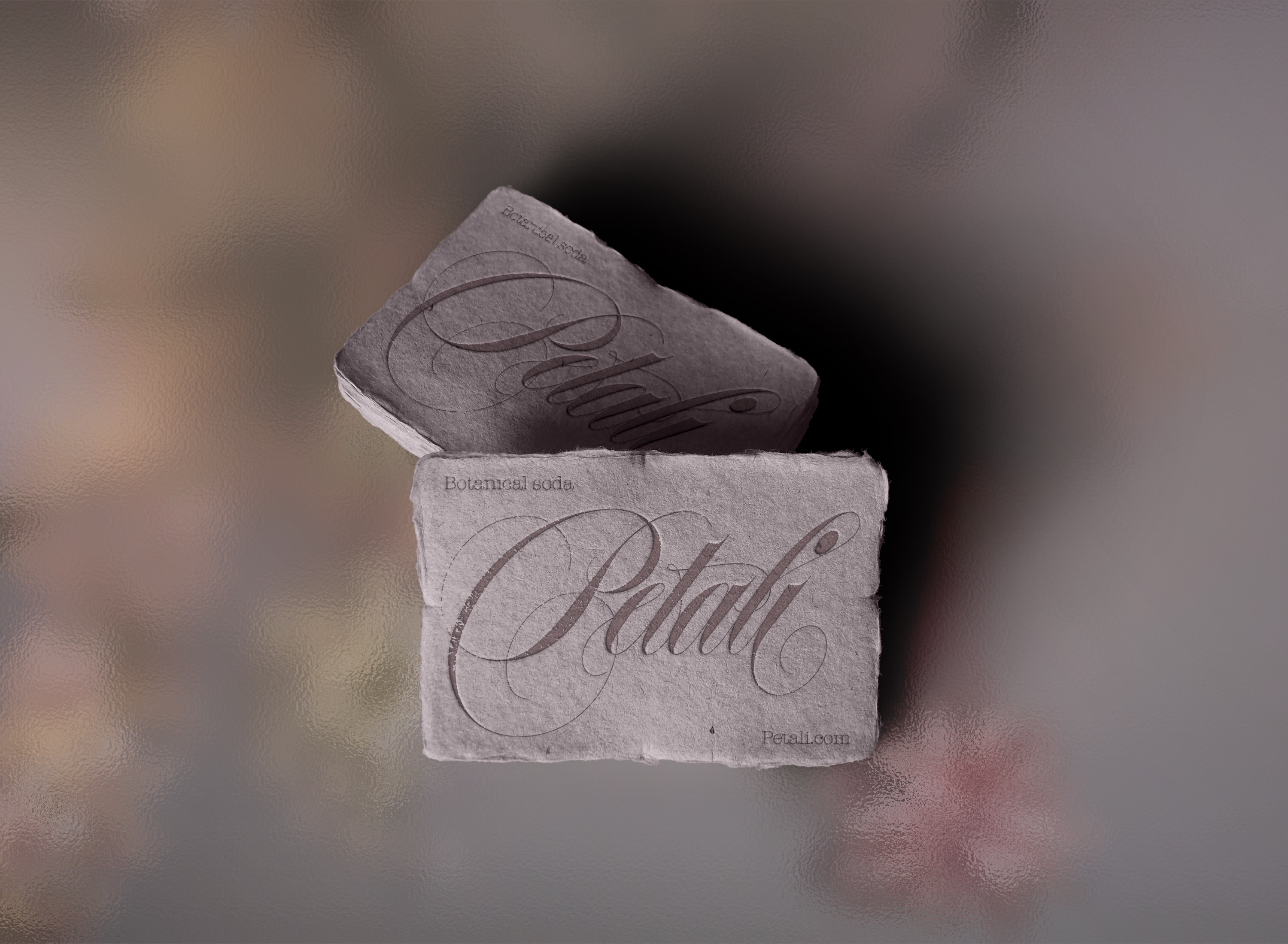
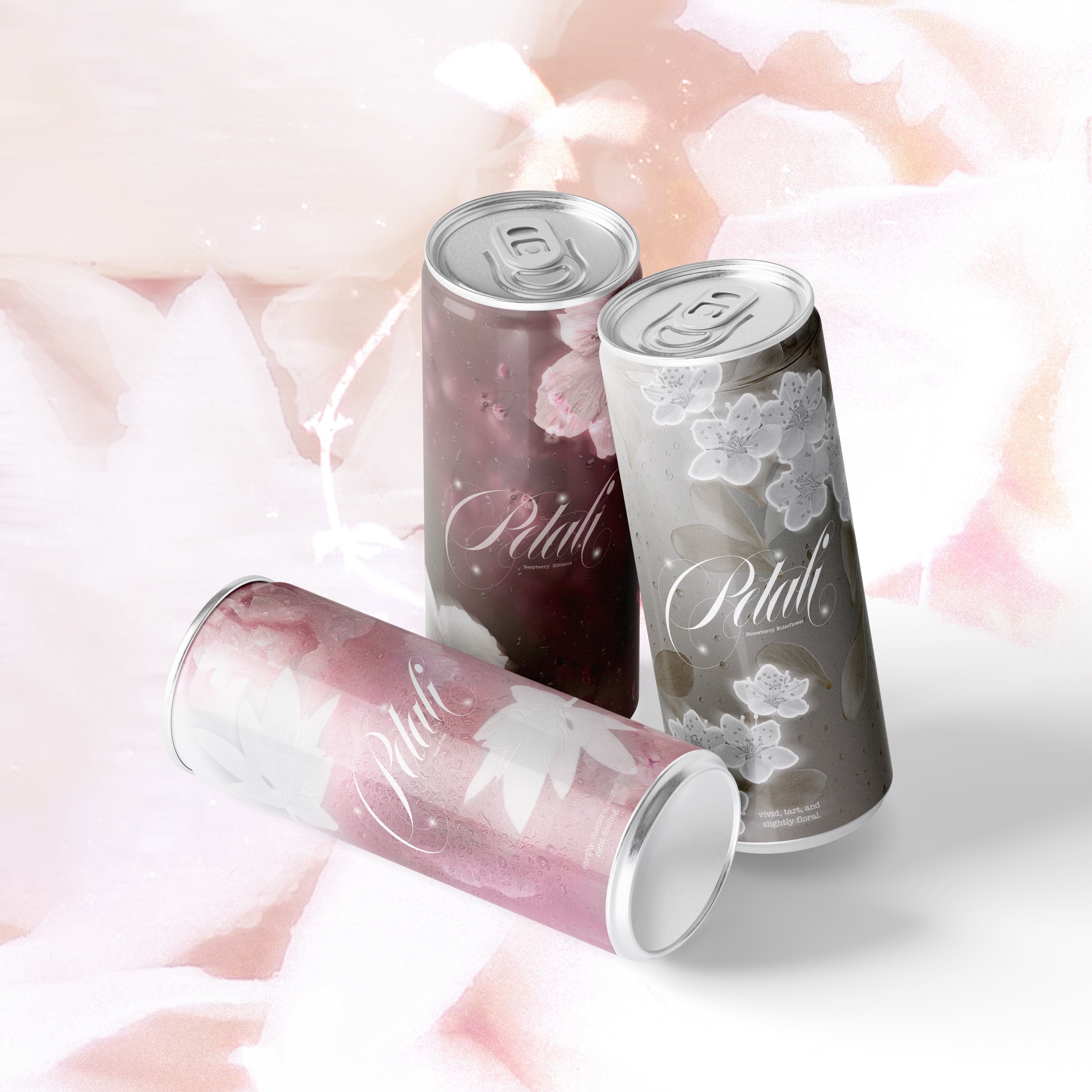
Petali started as a dream concept for me, magical, fun, floral, and beautiful. From the very beginning, I wanted its identity to reflect exactly that feeling. Being a soda, the instinctive approach might have been metallic, modern, and bold, but I chose the opposite. This deliberate choice creates a more exclusive and unique experience, setting Petali apart from the ordinary.
The intricate serifs, delicate floral patterns, and subtle water droplets are key elements in every design, details I’ll explain further in the following sections.
Research
Development
—
Process
I began by researching health-promoting flowers, gathering a wealth of information and details. Fast forward, I paired each flower with a complementary, flavorful fruit. This initial research laid the foundation for exploring visual interpretations. I followed an exclusive creative direction: soft, blurred, and dynamic patterns inspired by real flowers.
The logo became the centerpiece of Petali’s magical identity, featuring delicate sparkles and the elegant serif of the font Erotica. While each can reflects a different flavor and flower, the logo remains consistent, providing a unifying and recognizable element across the range.